Link to Face Book Album of images, At the sign of the Spotted Dog.https://www.facebook.com/media/set/?set=a.10150476511301424.427236.707526423&type=3Pub signs are a curious cultural thing, they originated with Richard 2, when he passed a statute for all pubs to have signs, further information on this, I do not have.
Then of course, Cromwell came along and people ceased to socialise in that particular fashion.
Unsurprisingly, with the restoration and Charles 2, pubs became fashionable again.
A whole load of new pub signs came out - largely to do with heraldic symbols and motifs, including older symbols like for instance: the White Horse.
Of course, as time has moved on, different symbols and designs have emerged. For instance: the Railway, the New Inn.
My feeling is that there must be scores of of possible new names for pubs to inherit which are close enough to the old ones.
http://en.wikipedia.org/wiki/Pub_names#Most_commonStarting with the ideas for alternative contemporary pub sign and their progress as they develop.The Spotted Dog. Two sides of an upright, possibly similar studies.
The Library.
Two sides of an upright.
The Library.
The Pirate.
Two sides of an upright.
The Pirate Ship.
The Jolly Pirates.
The Double Dip.
Two sides of an upright.
The Black Swan.
The Cheap Flight.
Two Sides of an upright.
The Dove.
The Lad in the Lane.
Two sides of a sign
The Welcome Inn.
The Railway. - could be double
The Rat Run.
The Crossed Keys.
The Dog and Duck.
The Queens Head.
The Happy Banker.
The Bird in Hand.
The Whistle Blower.
The Windmill.
Solar Panels?
The Royal Wedding?
The Watering Hole?
The Boars Head? - (King Boko)
The Cat and Fiddle?
ALSO:
The general pub sign painting,
The Library painting,
How to eat with a knife and fork.
The Dancing God?
The Award Clock Shield?
THE SHOW
PRINCIPLE
I was thinking about stuff that was peculiar, yet quite natural to my culture. ( also "my culture" within the culture that I live in.)
Ultimately, the thing that naturally fell into place was the pub and graphically speaking: the pub sign.
Pub signs are a curious cultural thing, they originated with Richard 2, when he passed a statute for all pubs to have signs, further information on this, I do not have.Then of course, Cromwell came along and people ceased to socialise in that particular fashion.Unsurprisingly, with the restoration and Charles 2, pubs became fashionable again.A whole load of new pub signs came out - largely to do with heraldic symbols and motifs, including older symbols like for instance: the White Horse or the Royal Oak.A sign of the times, a statement and reflection of that day and age.Of course, as time has moved on, different symbols and designs have emerged. For instance: the Railway, the New Inn.My feeling is that there must be scores of possible new names for pubs to inherit which are close enough to the old ones.
When I first went to start on a foundation art course in the early 70's, I was expecting to do sign writing, fairground type stuff. I was informed that in order to do that, I would have to take on a graphics course. Within which, likely as not, I wouldn't last a week.
I was a fine artist - which basically meant painting or sculpture.
Times change and maybe what could be fine art today was maybe not so then.
As with the early pub signs, art has to reflect it's time.
Painters are faced with the dilemma " how does my work fit, how is it relevant?"
As a separate body of work, as oppose to a total artistic change of direction I propose to present a body of work representing what could be contemporary pub signs, reflecting modern life with its advances and its problems.
Sometimes using old names with new meanings, introducing new signs to represent modern innovations or representing passing things. Some covering the same traditional ground but painted in a completely different contemporary fashion.
I hope they will be seen as bright and painterly as possible, with a certain emphasis on descriptive lettering.
PRACTICE
What I'm dealing with is a series of pub signs all contemporary in nature. Brightly coloured, albeit relatively simple, painted in a contemporary fashion, glazed and varnished.
I am aiming for about twenty signs, four or five being double sided and free-standing aloft on poles. And about the same amount hanging from brackets, double sided hanging at right angles to walls.
The rest would be one sided and representative of pub signs, screwed to the wall. They would hang and look like paintings though most would contain decorative lettering of one sort or another, obviously being signs.
There would also be two larger sized paintings.
One about the general subject matter within the show-i.e. a collection of signs presented in a jumble sale fashion.
-and one of the interior of a library - a pub name I have covered which along with post offices and Britannia and seems to be a breed which is slowly but surely dyeing out.
ROUGHS & PREPARATION FOR THE SHOW
A lot of the initial information for the show has come from Google images.
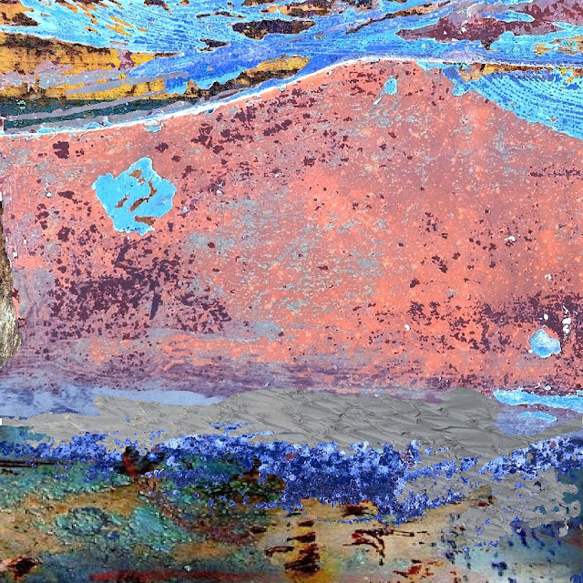
I have reproduced these in various combinations and montages: mainly in pen and ink.
These then have been scanned back onto the computer and sharpened up, enhanced and blended together, hopefully , still in a fresh way.
However , the image that I used for the signs comes from the pen and ink sketches made earlier on in the process.
I have 50 sheets of presentation card which I would use as a back-up and illustration to the project as a whole.
An explanation of the process as it were. Which could fit into an enclosed space.
The rest of the show (being signage!) would quite comfortable around and about in an external area.
It would benefit from an opening that looked like a pub, with bar, beer and jollyment.
The Happy Banker
The Queens Head
The Spotted Dog

The Double Dip
The Pirate
The Lad in the Lane
The Welcome Inn
Twitterbird
Have a drink have a drink have a drink on me, everybody have a drink on me.
Why I'm drunk all the time, it levels my head and eases my mind
I see better days and I do better things.
Happy New Year
Up Euros


