Wednesday, 22 January 2020

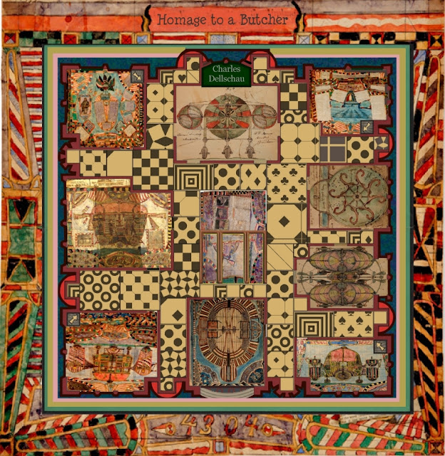
Homage to a Butcher


20-01-2020.

It is a collage, but a digital one, most of his illustrations I cropped a bit then mixed it all up.It's got me thinking now - if I've got time I'll write it out. Its reminding me of a large hanging from Rajasthan
I love his border colours and the way he carefully laid it all out, put together with a lot of love.


Charles Dellschau
Homage to a Butcher.


It started off as a study of a note book by Charles Dellschau, concerning aeroplanes & the design thereof.


The first thing that grabbed me was the bright colourful, yet earthy borders quite a comparison to the flying machines.


I thought that the best way to study them would be to work with them.
At present, I am thinking of ways to represent a fictional games board & thinking along those lines I felt that his borders would fit in and even solve a linear problem.


simplicity in a nut shell!


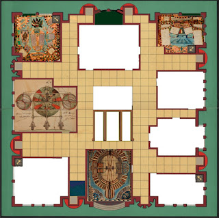
Eventually, I ended up with a Ludo board which would have various rectangles into which; I could insert some of his illustrations. & combined that with an old fashioned Cluedo board.
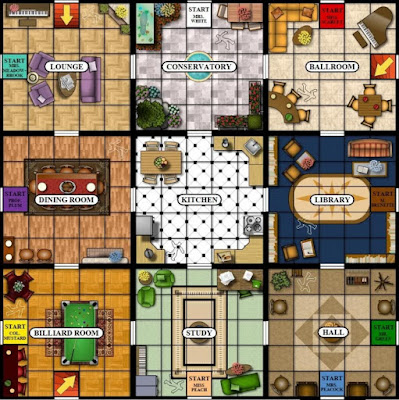


I suppose this one had the flavour that I was ultimately after!


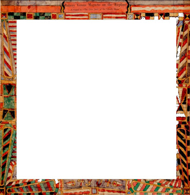
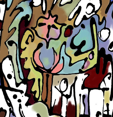
Two images that I cropped to fit into the frame more comfortably.


I started to work it as a kind of collage, only digitally. A kind of cut & paste affair in a stencil type fashion in that I was putting the boundaries onto the images rather than the other way round.
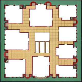

a PNG file meant that the white areas are in fact transparent.


putting the boundaries onto images.


future frame?


Charles Dellschau

Charles Dellschau


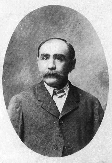
His story is one shrouded in mystery, almost lost forever, intertwined with secret societies, hidden codes, otherworldly theories and seemingly impossible inventions before his time. Unseen for decades and salvaged by a junk dealer in the 1960s from a trash heap outside a house in Texas, his entire body of work would later go on to marvel the intellectual world. But during his lifetime, Charles Dellschau had only been known as the grouchy local butcher.
a remarkable collection of strange watercolours and collage pieces. More than 2,500 intricate drawings of flying machines alongside cryptic newspaper clippings filled the pages, crudely sewn together with shoelaces and thread.
After his retirement in 1899, he took to filling his days by filling notebooks with a visual journal of his youth. He called the first three books, Recollections and recounts a secret society of flight enthusiasts which met in California in the mid-19th century called the ‘Sonora Aero Club’.
The Wright Brothers wouldn’t even make their famous first flight until 1903, but Dellschau draws dapperly-dressed men piloting brightly-coloured airships and helicopters with revolving generators and retractable landing gear. No records have ever been found of the Sonora Aero Club but Dellschau’s artworks hide a secret coded story. Whatever it was that he had to say was apparently too private even for his own notebooks and even today, much of the mystery has yet to be revealed.
A Mr. Pete Navarro, graphic artist and UFO researcher, heard about the “Flight” exhibition in 1969 and became enthralled. He believed there was a connection between Dellschau’s drawings and mysterious mass of “airship” sightings at the turn of the century across 18 states from California to Indiana. In 1972, he discovered that 8 remaining books of Dellschau were still sitting at the junk shop, unwanted and unclaimed. He bought the lot for $565 and spent the next 15 years obsessively decoding Dellschau’s work.

Some of his drawings tell of fatal crashes of the society’s airships, sabotage of other club members and the banning of members who talked about the secret organisation to outsiders. According to Dellschau, the club’s aero prototypes would travel the open roads disguised as gypsy wagons to avoid detection.


Friday, 17 January 2020

Sapphire Sky


17/01/2020
Wishing you a Sapphire Sky Down Under.

Started as a direct response to the catastrophic bush fires going on in Australia.


My discovery of the Aboriginal Flag and the fact that it corresponded so well to actual photos of what is happening in the sky there at this moment in time was the catalyst for me to think clean & crystalline. Back in the day those fires must have been such a big, frightening force.


At which point ~
I sent my regards and worries to Sue Macleod Bere, living in Sydney 
and wished her a sapphire sky (after the smoke)
Blue skies above us, everyone’s in love.

The only New Year’s resolution I have ever kept Sue!


Something like:
Paint,
Paste,
Glaze.
A couple of people have pointed out that this resembles the “May Promise” of a couple of years back.
I didn’t paint this as a direct response or follow-on to that one, but I can certainly see the close similarities.


It’s a system of painting that on occasion I dip into.
Especially, if I don’t have too much room, or if the paints are cheap.
It can also keep the painting fresh as it goes along.


I’ve had comment/praise on my use of blue recently.
It isn’t my strongest colour, though possibly my safest colour.
It’s what I started learning about how to paint with colour.
Two Blues ~ Two Browns & you have a spectrum.

earth,flesh & a clear sky.
5-1-2020.


Then,
I couldn't hold back the intensity!


A couple from Dal Lake Srinagar 83


This formula will pass before my eyes very quickly.
(For the moment) It's a rhythm of paint!


28-02-2020.


Sapphire Sky Notes.


I started out with pencil and a long ruler, then using those lines to work from, then made it more of a collection of triangular patterns with~~~
Felt tipped pen, the sort that you buy in packs of twenty and non-waterproof so that with water brushed on, half of that line would smudge out. With just one mid-range “indiscriminate” blue. These felt tipped lines comprise of maybe 1% of what you can see in the finished picture.
A lot of the lines that you can see a few of layers down are in fact edges of blue glaze applied with a palette knife.
On occasion, I do use water colour pencils but not on this one, I use them sometimes for much bolder, smaller pictures with a raw edge where subtly isn’t the issue!

The bolder lines you can see are (I think) nearly black with blue in them. They were squirted on from an old hair colour bottle. Because I had a layout (almost grid) it allowed me to be more spontaneous ~ follow the flow as it were and high light the more important corners. As the painting went along it became a bit “samey” at which point I started adding oblique paper patch triangles which I had painted over with various shades and tones of blue.

From here it went on in this vein until I felt I couldn’t adjust it anymore! As Klee said, a painting is like a potted plant, you water it every day and one day, it is grown, (or something like that).
As an afterthought ~ each move I made was to inspire, act like a catalyst for the next one, whilst leaving the whole thing as open as possible.


There is a name for the technique where you make straight lines fuzzy & exciting by adding a little water. I don't know it!

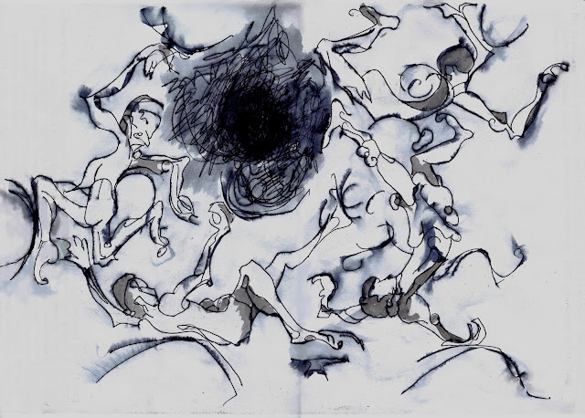
The upper picture was simply sprayed and came out fuzzy all over. I never intended to take it any further, but use it as general information. As in ~ maybe the thing could go in that direction.

The lower, I did use to give the lines a bit more form. I used this one in a much bigger picture and feel that it also stands by itself.


Both these drawings are for:

an elaborately crafted dancing floor,
like the one Daedalus created long ago in spacious Cnossus,

http://anatalianpostcards.blogspot.com/p/umphries-my-fourth-site-following.html

Sunday, 12 January 2020

Y New Year


Initially, after I had drawn it,I was going to paint it as a grid, a checkerboard mosaic with the lines just happening on top.


 The man that never gave up not believing in himself.

Where it went ~ I had to go.
But following the guide lines I had laid out before.


It was originally one of five paintings which went under the label “Y New Year”. Well, the file that I stored the images in came under that title.

This was about 85% digital 

(on a twenty year old art programme) Absolutely no frills.

In a sense, it was a bit like a glass painting in theory, but not practically. Painting on (or behind) glass goes basically back to front – you put those drops of water on the leaves first – covering the finished detail then covering more and more ground – layer by layer until you put the ground down, covering everything.
I had a spell of painting on glass mainly back in the mid 70's, but cant seem to find any photos at the moment.


With this, it was a case of drawing first, with an adapted hair colour applicator - squeezing the lines out very quick. No time to think. 


Then “blocking that in” on top digitally until I couldn’t see any lines any more. The colours were in no way preconceived, I just put them in one by one.


I then fitted the original GIFF drawing back on top ~ which, apart from the lines, was transparent.


At this point, it needed tidying up. The final procedure which took longer than the previous bits combined


Not a bad progress chart, mind the different stages did get shuffled up a bit.
*