17/01/2020
Wishing
you a Sapphire Sky Down Under.
 |
| Started as a direct response to the catastrophic bush fires going on in Australia. |
 |
At which point ~
I sent my regards and worries to Sue Macleod Bere, living in Sydney
I sent my regards and worries to Sue Macleod Bere, living in Sydney
and wished her a sapphire sky (after the smoke)
The only New Year’s resolution I have ever kept Sue!
 |
Something like:
Paint,
Paste,
Glaze.
 |
| It’s a system of painting that on occasion I dip into. Especially, if I don’t have too much room, or if the paints are cheap. It can also keep the painting fresh as it goes along. |
 |
Then,
I couldn't hold back the intensity! |

This formula will pass before my eyes very quickly.
(For the moment) It's a rhythm of paint!
I started out with pencil and a long ruler, then using those lines to work from, then made it more of a collection of triangular patterns with~~~
Felt tipped pen, the sort that you buy in packs of twenty and non-waterproof so that with water brushed on, half of that line would smudge out. With just one mid-range “indiscriminate” blue. These felt tipped lines comprise of maybe 1% of what you can see in the finished picture.
A lot of the lines that you can see a few of layers down are in fact edges of blue glaze applied with a palette knife.
On occasion, I do use water colour pencils but not on this one, I use them sometimes for much bolder, smaller pictures with a raw edge where subtly isn’t the issue!
28-02-2020.
Sapphire Sky Notes.
I started out with pencil and a long ruler, then using those lines to work from, then made it more of a collection of triangular patterns with~~~
Felt tipped pen, the sort that you buy in packs of twenty and non-waterproof so that with water brushed on, half of that line would smudge out. With just one mid-range “indiscriminate” blue. These felt tipped lines comprise of maybe 1% of what you can see in the finished picture.
A lot of the lines that you can see a few of layers down are in fact edges of blue glaze applied with a palette knife.
On occasion, I do use water colour pencils but not on this one, I use them sometimes for much bolder, smaller pictures with a raw edge where subtly isn’t the issue!
The bolder lines you can see are (I think) nearly black with
blue in them. They were squirted on from an old hair colour bottle. Because I
had a layout (almost grid) it allowed me to be more spontaneous ~ follow the
flow as it were and high light the more important corners. As the painting went
along it became a bit “samey” at which point I started adding oblique paper
patch triangles which I had painted over with various shades and tones of blue.
From here it went on in this vein until I felt I couldn’t
adjust it anymore! As Klee said, a painting is like a potted plant, you water
it every day and one day, it is grown, (or something like that).
As an afterthought ~ each move I made was to inspire, act
like a catalyst for the next one, whilst leaving the whole thing as open as
possible.
There is a name for the technique where you make straight lines fuzzy & exciting by adding a little water. I don't know it!
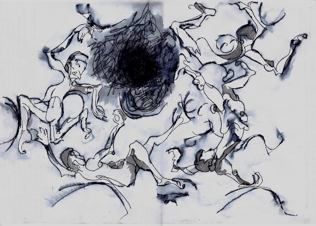
The upper picture was simply sprayed and came out fuzzy all over. I never intended to take it any further, but use it as general information. As in ~ maybe the thing could go in that direction.
The lower, I did use to give the lines a bit more form. I used this one in a much bigger picture and feel that it also stands by itself.
Both these drawings are for:
http://anatalianpostcards.blogspot.com/p/umphries-my-fourth-site-following.html
There is a name for the technique where you make straight lines fuzzy & exciting by adding a little water. I don't know it!
The upper picture was simply sprayed and came out fuzzy all over. I never intended to take it any further, but use it as general information. As in ~ maybe the thing could go in that direction.
The lower, I did use to give the lines a bit more form. I used this one in a much bigger picture and feel that it also stands by itself.
Both these drawings are for:
an elaborately crafted dancing floor,
like the one Daedalus created long ago in spacious Cnossus,
http://anatalianpostcards.blogspot.com/p/umphries-my-fourth-site-following.html


No comments:
Post a Comment